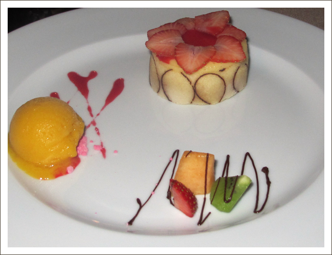
Is this gorgeous, or what? Three very tiny bits of desserts (Heavens, I think that’s about 1/8 of one strawberry and a melon ball worth of mango sorbet!) with lots of bare plate all around. I snapped this pic at Sunset Mona Lisa in Cabo. It helps me remember how important it is to follow the same principle of design that print artists use — leaving adequate “white space” around the content (in this case, the food) to really make it pop.
We live in the era of all-you-can-eat buffets where people heap their plates, trying to make sure they get their money’s worth of what is often overcooked and unappetizing-looking fare. Nourishment for the body, perhaps, but nothing to tickle the brain’s visual pleasure receptors.
The layout here makes each of the desserts a star. You can see and admire each one individually. A little splash of strawberry sauce, a squiggle of chocolate. It’s like in an art gallery where you need to be able to step back enough to truly appreciate each painting. Art on a plate, and it starts with avoiding overcrowding.
As we begin a new year and we’re conscious of a desire to eat more sensible portions, this picture illustrates that small portions do not need to feel skimpy. Artfully presented, they provide a feast for the eyes.


Leave a Reply