Color plays an important role in how we see things. If a person looks grayish, we talk about him having bad color. When broccoli goes from vibrant green to yellowish-green, we know it’s overcooked and is going to be mushy.
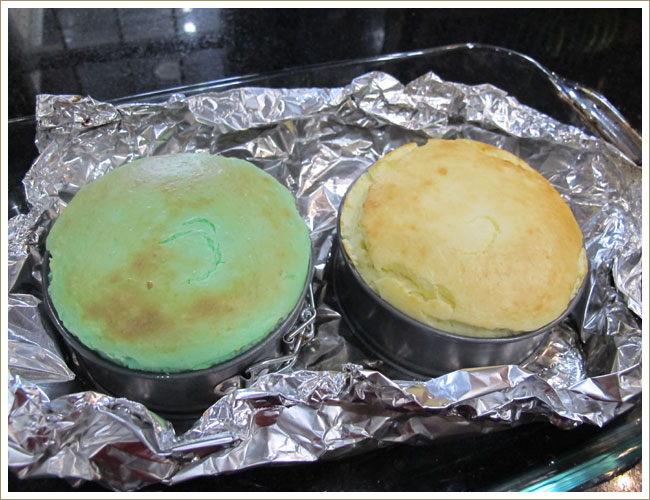
Sometimes a subtle variation in the shade of a particular color will make the difference between a hit and a miss. Recently, I had a big miss when a small lime cheesecake I made had a bad color day.

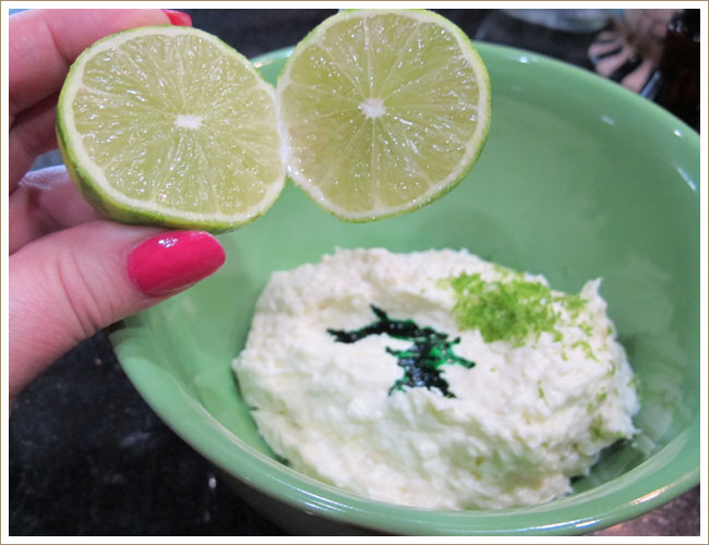
My thought was that by adding a little green food color to my cheesecake batter before baking, I would be creating a visual connection between the flavor of the cheesecake and a color that corresponds with the fruit that produced the flavor (lime). Makes sense, right?

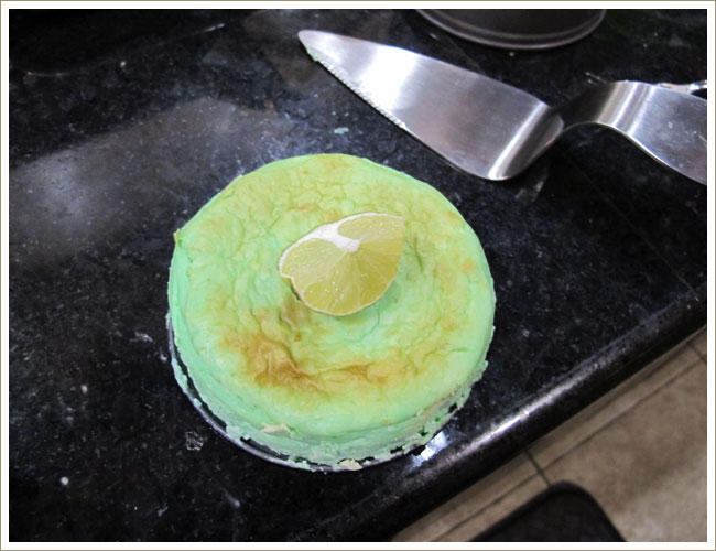
Epic fail (as my friend Linda would say). The problem is that the shade of green didn’t have the look of lime at all. There was too much of a blue overtone to the green, so it looked more like mint than anything else. In fact, I didn’t even bother to do lime slices as garnishes, once I saw what a wedge of lime looked like when placed on top for a test. ICK!!! The combination was absolutely hideous.
There was truly only one solution for this wretchedly-colored sweet: Eat dessert by candlelight! And, in the future, back away from the food color.


Leave a Reply