As you know, if you’ve seen my Critique on the issue, I learned a valuable lesson about the design obstacles posed by placemats which feature the main design element in the middle. It wasn’t until the last minute, when we were getting ready to sit down to eat and I had placed the plates on the placemats that I realized what I was hiding.
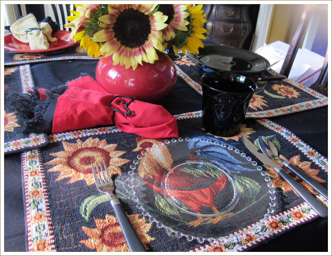
Use a clear plate, right? That allows you to see the entire placemat. Well, it just doesn’t work. Glass plates have a spring/summer feel. Hot weather, summery colors. Dragging them into the middle of a black and gold setting just creates a disconnect.
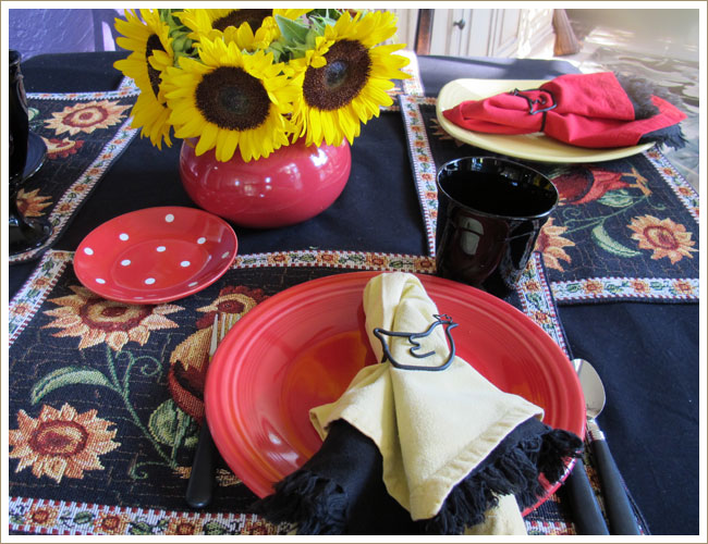
Perhaps moving the plate to the side a bit, allowing the rooster to peek out would work. Nope. There’s something off-kilter about it. The chicken napkin rings are cute, however. Note that I’ve combined two napkins. It’s not because breakfast was going to be terribly messy, it’s just a great way to pull your colors together.
 >
>
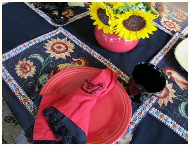
Here you see it from a different angle. Still doesn’t work.
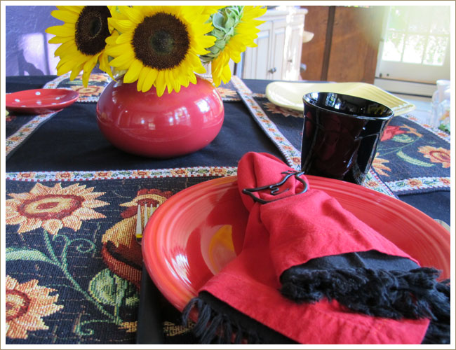
The red napkin on red plate combination doesn’t get my vote either.
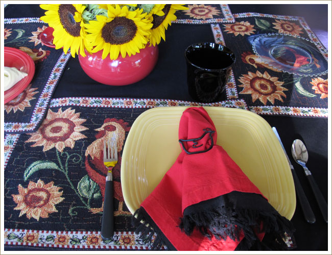
I love the square Fiesta plates, but the yellow color is too pale. It looks washed out in the face of the gold sunflowers.
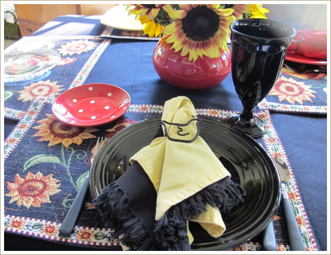
I could live with this. The polka dot plates adds a touch of whimsy. The yellow napkin on top makes the chicken napkin ring stand out. The black plate strikes the right tone with the placemat. You can see a little of the rooster, but it’s not ridiculously to the right. And the glass fits right in.
I’m still getting rid of the placemats, however. . .


Leave a Reply